
Book Covers
This is the 10th article in my publishing series. Non-publishing content will return in February, so if you are reading this and aren’t interested in this topic, please check back then.
—————————————————————————
Covers. There is so much to discuss with covers that I could write multiple articles on it. But, I’ll just write a longer blog post instead. Most people know that covers are important to the process, however, they aren’t sure where to start or what to do with covers. The cover is, perhaps, the single most important feature of your book. Imagine that you are perusing a book store, either in person or virtually. Maybe you don’t have a particular book or author in mind, you just want something that will strike your fancy. You stroll up and down the aisles, or browse pages of books sorted by category. What makes you click on a book or pick it up? The cover. Every time. If the cover is unappealing, people will not pick up the book (unless of course they’re specifically looking for it, but we’re assuming that this isn’t the case – we want new readers). Your cover art has to be compelling. Having a bad cover image is the kiss of death. Especially, when you think back to my earlier articles when I discussed how many new books are published each month.
Okay, so you need a good cover. But how do you get one? Some people are very artistically talented and can just make their own amazing covers, or they are married to an artist, or are good friends with an artist or something. I’m going to assume that this is not you. The easiest, and also most expensive option, is to hire a professional cover artist to make your cover for you. When it comes to hiring a cover artist there are two ways you can go. The first, involves hiring a talented artist to make custom art specifically for your book. This is by far the most expensive route, but also the most worthwhile, if you have the budget for it. This is what helps your book to stand out. Covers from this category can easily range from $500 and up to a few thousand, depending on the artist. Every now and then you can find them at a better deal, but plan for hundreds of dollars if you go this route. The other option is what I affectionately refer to as a “cover mill”. It’s not a knock against their talent or ability, but rather a comment about the proliferation of the products. These people can produce covers quickly and tend to crank them out in high volumes. Because they take less time, they also tend to cost less money. But, I’ll be frank – if you have any artistic ability and the right tools you can (maybe) produce covers like this with practice. What these people do is they buy accounts to stock photo repositories and then look for stock images that they can combine and remix in many different ways to be able to make “premade” covers. They usually just made a cover that fits a theme or idea and then when someone wants that cover, they add a title and there you go. There are a lot of talented people who do this, and they often do it creative and talented ways. In many cases these artists will be able to produce a better cover than you can do, and they’ll be less expensive than a custom artist. This is a good place to start for most people. The potential downside is that these artists are all drawing form the same pool of stock images. There are only so many “elf girl” or “space ship” stock images to begin with. It’s a given inevitability that elements of your cover (if not the whole image) may also be present in another book by a different author as well.
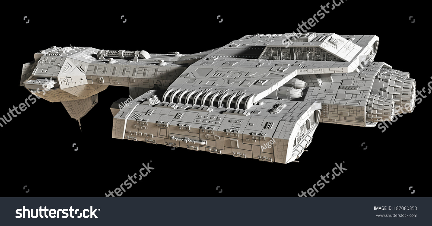
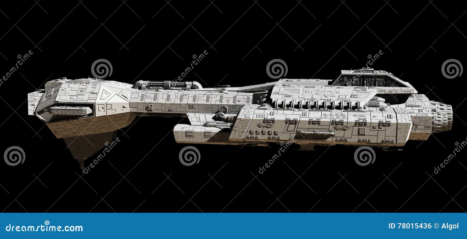
I would generally advise against pulling images together and making your own, unless you have the proper tools and some skill at remixing photos. Part of the problem of doing it on your own is that you have to be sure that the images you choose are either public domain or creative commons (meaning that no one has a legal claim to that image), and that it’s not otherwise copyrighted or trademarked in any way. Even if you did a google search for “royalty free spaceship” whatever images you find there will almost certainly have already been used by others. It’s so bad that in my Sci-Fi writer’s group, we joking refer to one of them simply as “the ship”. It’s everywhere.
Going left:
From the side:
Banking left:
![]()
Banking Right:
![]()
Coming towards you:

Head on:

And even set in pre-made space backgrounds:

It’s everywhere. Sometimes you don’t have a choice, especially if you are just starting out and can’t afford to hire an artist. But, in those cases I would urge you not to pick the images right at the top of the search result. Find something more obscure. Email people from ArtStation or DeviantArt and see if you could purchase rights to use their images. Get creative.
Speaking of images, what goes on the cover? This is probably the biggest misconception and hang-up that people (and by people I mean authors) have – the cover does not need to be a scene from your book! I’ll say it again, the cover image does not need to be a scene from your book. The cover’s sole job is to attract interest and make you pick it up and take a closer look. That’s it. It doesn’t have to convey the particulars of your story (that’s what the blurb is for). It just has to be a compelling image. As a classic example, one of my favorite books by a literary role model:

This particular scene depicted here never happens in the book. Ever. And that’s okay. It’s not really important. In many cases covers will depict something specific a scene, a character, something. But in many of those cases the images are either custom-made for the book, or they are taken from a TV or film adaptation. At the very least, the cover should indicate the genre and be compelling.
I will take a moment here to add another thought. If you have taken the time to hire a cover artist, trust them. I know some cover artists and sometimes I freelance my abilities in that arena, if time permits. Customers (authors) will sometimes approach the cover artist and recommend changes to the cover because it fits their specific vision of what the cover should be. Don’t do this unless the artist is asking for feedback. Cover artists have practice at making cover art. The do things specifically and for a reason so that it attracts attention or evokes an emotion. Mind you, if I’m working on a contracted cover, I won’t tell paying customers no and usually acquiesce to their change, but I hate doing it because it makes the cover bad to the point where I’m sometimes embarrassed to have to my name attached to it.
If you want to try your hand at making your own covers, here are some things to keep in mind about composition. Of the image itself, ideally, the focal point image should be more or less centered. You can divide the cover into halves, thirds, or Quarters. Some of this decision for framing will be dictated by where you want the title text to appear. For example, if you want the name and title both on top of the cover, then the image should be 2/3rds with the top third more or less empty. I tend to use quarters for my covers. I’ll have the top and bottom quarters more or less empty, and the middle two quarters are the focal point of the image. (To clarify, by “empty” I don’t mean devoid of everything, I mean containing only background stuff that won’t be missed if you put text over it.)
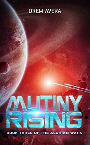
For colors, there’s a ton that can be said. Generally, it’s not considered a good practice to have the entire cover be of the same basic color. Example, and blue cover with blue font. That’s generally not a good idea. But, it can work in some cases, like my friend Drew’s book, below. He’s able to make it work because the text is separated from the other yellow by dark borders. It’s easily readable, even as a thumbnail image – which is always a very important consideration when doing covers. 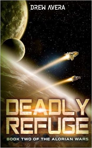
One important tool is the color wheel. Save it or print it out and keep it handy. (https://graf1x.com/wp-content/uploads/2014/09/color-wheel-poster.jpg)
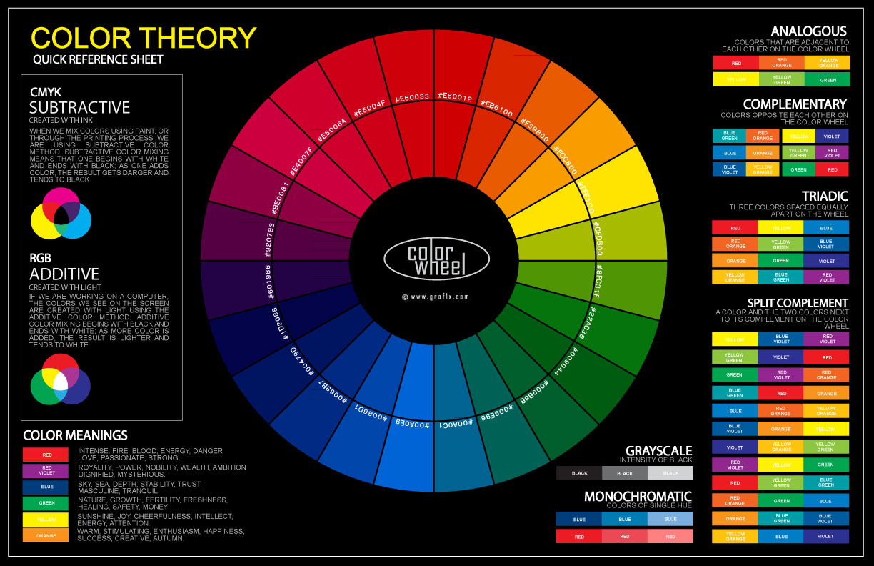
Creating contrast between the text titles and the background images is very important for ensuring that your text is easily readable. Complimentary colors work well for this – colors that are on the opposite side of the color wheel. My friend Drew Avera’s cover for Broken Worlds illustrates this concept well.

Another important concept is the Triadic. It you were to take colors from 3 equidistant parts of the color wheel (like an Y shape or an airplane propeller), this is the triadic. This can be useful for finding colors that work well together to create good contrast. For example, red, yellow, and blue are triadic with each other. If you had a cover that a lot of reds and oranges and yellows in it then green (red’s compliment) might not look so good. But Blue, the third part of the triadic, might compliment well. You can also just use colors from the triadic to create contrast if you’d like. Again, Drew uses this to good effect. Red’s compliment is green. But that doesn’t look great, so options along the triadic include yellow or blue, both of which would compliment well.
The last thing that you can do with contrast in titles is to simply use white text. I do this with many of my covers. My friend MD Thalmann did with his book 13 Lives of a Television Repairman.

White is not part of the color wheel, so it goes with everything. Other thing about white, is that if your primary color background is white, then you can use any color for the title. Depending on the genre, you can also de-saturate an image (remove all color) and then use a mask or another layer to bring back specific colors. The movie Schindler’s List did this with the girl’s dress. I used the same technique on the contracted cover I made here for a contemporary fiction novel.

If you are dead-set on using a monochromatic color pallet, you must make sure that the text is separated and defined clearly. A border of some kind surrounding the letters is the easiest way, but there are other methods. Also, having thicker letters helps as well.
Speaking of text, we need to talk about that. Ignoring font choice for the moment, what do we put on the cover? The title and your name, obviously and at a minimum. You do not need to put the word “by” on the cover. Don’t do that. Never do that. You may want to include the words “a novel” if there is a fear that your book title might be mistake for nonfiction. But at that, it should be more of a footnote, than a major element. Reviews are also best left off the cover, unless the review is from an A-list celebrity. But if the book has won or been nominated for an award, definitely put that on the cover.
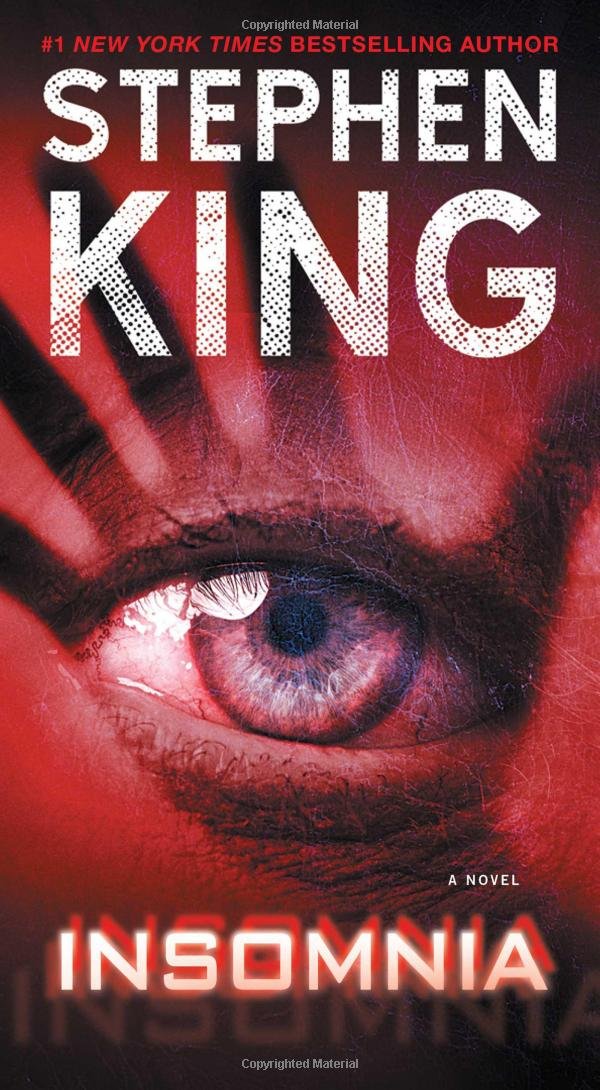
Most people will have the name of their book as the largest element, and then their name slightly smaller. However, if you are an award winner author with an established brand and hundreds of thousands of followers and a best-seller then your name could be bigger. Stephen King is an example of an author in this category. The important part is that HE wrote something. You’ll note that the cover artist chose white for contrast, and the words “a novel” appear to let people know this isn’t a book about the medical condition, insomnia. If you happen to be an award-winning author, it’s usually a good idea to include that, but only in small text.
Unless people will just flock out and buy your book because it has your name on it, like Mr. King’s, I would suggest keeping the title bigger. As for the rest of the text on your cover, less is more. The fewer words, the better. And if you do include other elements, like the name of a setting, or a book number for a series, that text should be smaller than everything else. Aside from James Patterson, who seems to be able to get away with whatever he wants for a cover, a cover that is just nothing but words will turn people off to your book. Unless you sell a bajillion copies, like Patterson does, avoid the “cover of text”.

Let’s circle back to fonts. The font should match the Genre. This is a must. You can’t have a Sci-fi Thriller novel that has pretty, swirling, cursive fonts. It just doesn’t work. If you aren’t sure what fonts go with which genres, there are many helpful resources out there. Try googling “best fonts for ______” and see what comes up. I also wouldn’t use the exact same font that those resources recommend. For example, if you wanted a big blocky font with chunks missing or worn out, then go to one of the many free font websites and search through the database for something appropriate. Use a more obscure font. Or, if you have the tools and the knowledge, create your own font. Or modify one.
Also, as a general rule, you shouldn’t use too many different fonts on the cover. Generally, two is a good number. Three is about the maximum. You may also use different colors, but again, not more than 2 or 3 colors, at the most. (Non-fiction books seem to be an exception to this guideline). Generally, if you want to use multiple colors, a good practice is to make your name one color, and the rest of the text another. Look back to the covers above and you’ll see that they all follow this pattern.
Consider the use of font effects. Especially for the title. You need to make it pop out. Use beveling. Use glow. Use Drop Shadow (<–timeless classic). Use textures and gradients and other overlays to create depth and character. Play around with it and find out what works.
We already talked some about genre and making your cover match the genre. Until you become a super-famous “brand” where your name alone sells books by sending people into a fervor, you really should stick to genre concepts. Sci-Fi books have; an alien, a robot, a spaceship, a planet, a future-soldier, or some combination of those. Thriller and crime books have; a cop, a shady-looking bad guy, a victim, a weapon, or something along those lines. Google other covers in your genre. Peruse the best-sellers in the Amazon store and see what others are doing.
Part of matching the theme also includes getting the right tone or feel of the cover. In addition to the color wheel, there’s another chart you should get familiar with here: http://enacademic.com/pictures/enwiki/72/HSV_color_solid_cylinder_alpha_lowgamma.png.

Hue is simply the color (from the color the wheel). Saturation is how much of that color is present. Imagine that you have an egg and a bowl of dye. The longer you let the egg sit in the color, the richer that color becomes. If you just dip the egg into the dye for a second and pull it out, there’s just a faint tint of that color on the egg. This is saturation. 0% saturation is white – no color. 100% saturation is fully colored fully. The last element is “values” or “brightness”. Pay attention to this in genre as well. If you have a book that is a thriller book or a post-apocalyptic doomsday novel, then you want the colors to be more subdued/greyed. Reduce the brightness/value of the color to make it darker. Conversely, romance books should generally have a higher brightness and be more upbeat and lively.
Also pay attention to the psychological concepts presented by covers. You want to pique their interest. An action scene is a great way to do that. If not, something that creates tension, curiosity, or other emotions. As an example, for a thriller book, a hooded figure holding a knife with their face hidden is always scarier or more intense than a bad guy who’s face you can see clearly. The shrouded face creates mystery. Who is it? It could be anyone. Maybe it’s a neighbor or a coworker. Maybe it’s someone you know. You don’t know. When you see their face, it ruins the mystery and kills that tension. This is also why a lot of fantasy covers show a fearless warrior about to face-off with a terrible beast instead of showing the aftermath of the battle. Beforehand the cover makes you ask, who will win? Will the warrior survive? The latter image says “I know how this book will end” and kills the mystery, alleviating the tension.
Also, as a general rule, don’t include random or obscure images on the cover. You want the cover to appeal to as many people as possible. If your book is about a cyber-hacker who is bringing down a wave of terror on the city by exploiting some super-amazing Linux skillz(tm), then including a penguin on the cover is a terrible, terrible idea. Few people will understand the reference. Sure, people who use Linux might appreciate the nod, but they represent a very, very small segment of overall readers who might potentially buy the book. If your reader picks up the book and asks themselves “what the hell is this and why is it on the cover?” they are likely to assume that your writing is equally confusing and give the book a pass. Especially if the concepts are not apparently unrelated – like the aforementioned computer hacker and a wrench or a screwdriver. What does that have to do with anything? It’s specific to the program he uses? Great, leave it off the cover as it will confuse people who don’t know the program and alienate potential readers.
All of this said, don’t be afraid to experiment. Covers are art. Nothing I’ve outlined above is an absolutely unbreakable rule. There are exceptions to everything. If sales aren’t going well, you can always change the cover later. If you do, I strongly encourage you to update the printer’s number release it as a new printing.
I hope that you found this article helpful. Next week I’ll discuss titles.